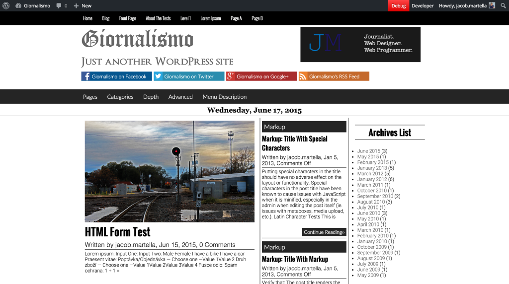
Complete Style Change for Giornalismo
So after the success of Nuovo and the JM Breaking News plugin, I’ve restarted working on Giornalismo full time. I ended up getting a ton fixed on it over the past couple of days, but no one change was bigger than the font and a slight color change.
After taking a beginner graphic design class this past semester, I’ve started to look at web design in a different light. For one, I’ve made the decision to move away from the basic black, the #000000, and move to an off black, more along the lines of #252525 if you know hex color codes. It’s not an exact black, but it’s not really a gray either. It works very nicely on the white background especially.
And then there’s the biggest change — the fonts. Before the fonts were a mix of Arial, Times New Roman and Georgia. But after taking the class and studying more graphic design, I made the decision to move away from all of that and go in a radically different direction.
The result: Lato for the main menu and most of the headings, Open Sans for the post bylines and h1 – h5, Oswald for the top menu and story headlines and Roboto for everything else. All of these are sans-serif font, which now gives the theme a more modern and sleek look. And I think it has changed the theme so much for the better.
As for what’s going to come next, I’m working on setting it up for mobile with a much better and cleaner mobile menu and going through and making sure everything is responsive. This ought to take me a while, given the amount of code this will take. After that, it’ll be time for tablets and then extensive testing before submitting it hopefully by early August.