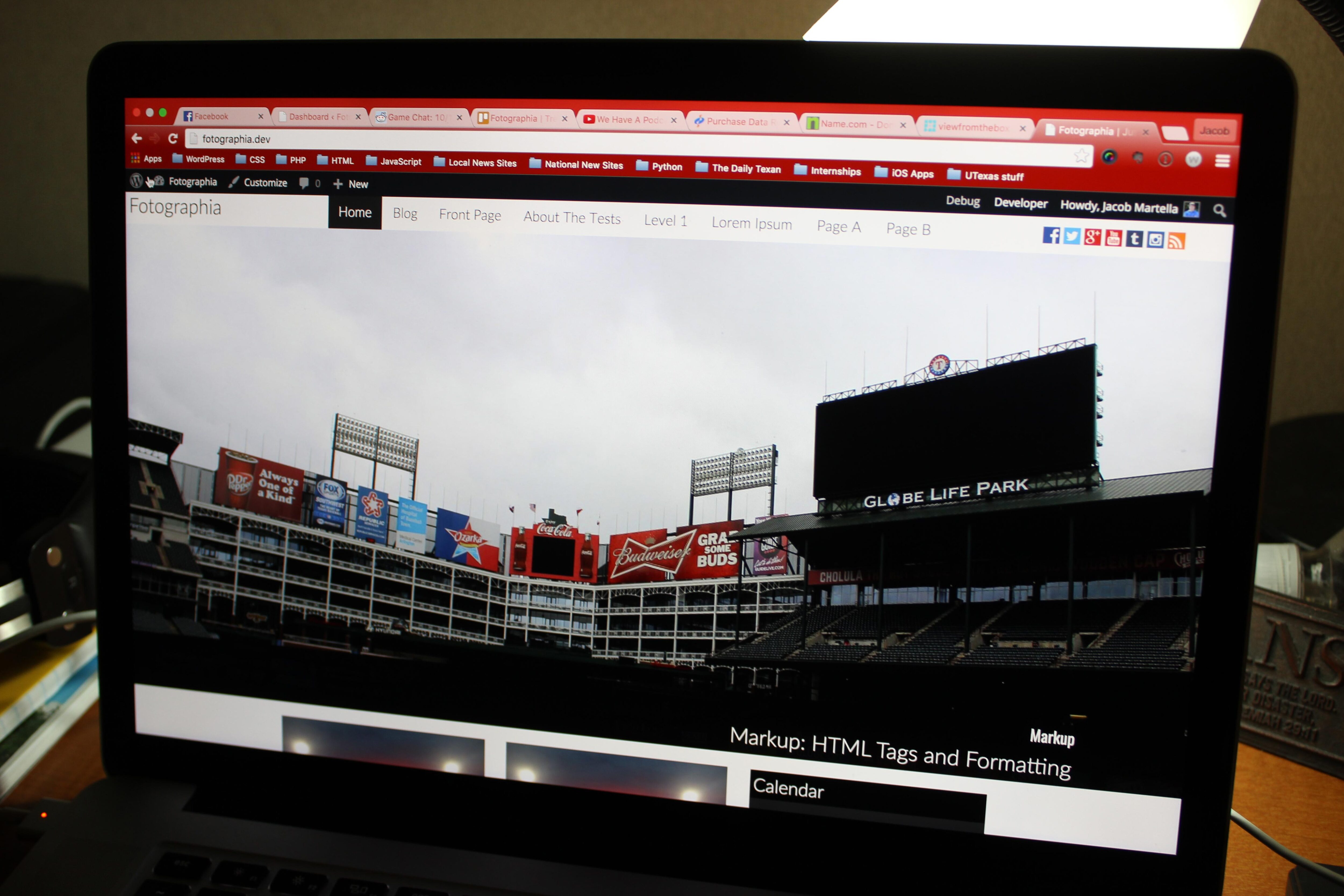
Large Front Page Images
The front page is a great spot to show off your work and Fotographia does that for you. Display five posts in a full-width section that gives your readers a great glimpse into your work.
Social Media Links
Direct your readers to your social media sites. Fill out the links in the theme options part of the Customizer and the images for the specific social media sites will show up in the header.
Responsive
Fotographia is designed with responsiveness in mind. Your site will look good whether it’s on a large desktop or on someone’s smart phone, and you won’t have to worry about.
Full-Width Images
Designed with photo stories in mind, Fotographia essentially requires large featured images, as regular images you include in your posts. It’s best to make sure that all images are at least 2000px wide and the recommended ratio is 2:1, although it’s not required. To get images in the posts to be the full-width of the screen, set the image alignment to ‘none.’
Post Navigation
Users will be able to navigate between posts easily with previous and next post links at the bottom of each post.
Post Preview Slideshow
Readers will get to see the different photos included in each post when they hover over the story link in the home page or in one of the archive pages.
Custom Header
Add your branding to the site with a custom header. Upload the header in the Customizer. The largest the custom header can be in 200px by 50px.
Custom Background
Add your own flair to the background of your site with a custom background. The recommended practice is to use a solid color background, but a photo background works as well.

